
Taylor Swift Song EDA
Whether or not a fan of hers, Taylor Swift's music is heard and loved everywhere. This post shows how to collect data about Taylor Swift songs from different sources.
Introduction
After collecting and cleaning my data in my last post, I am going to do some Exploratory Data Analysis. I will mostly look at the dataset regarding Spotify data, and in a later post, I will look at how the trends in this dataset compare to the Billboard Top 100 and lyrics datasets. The Taylor Swift Spotify dataset includes all songs released by Swift, and lists the song attributes. These attributed include factors such as valence, energy, speechiness, and multiple others.
Figure 1
I wanted to be able to see how the different variables within the Taylor Swift Spotify dataset were correlated. Shown below is a correlation matrix on this data. The brightness indicates the strength of the correlation. Cool colors indicate a negative correlation, whereas warm colors are positive.
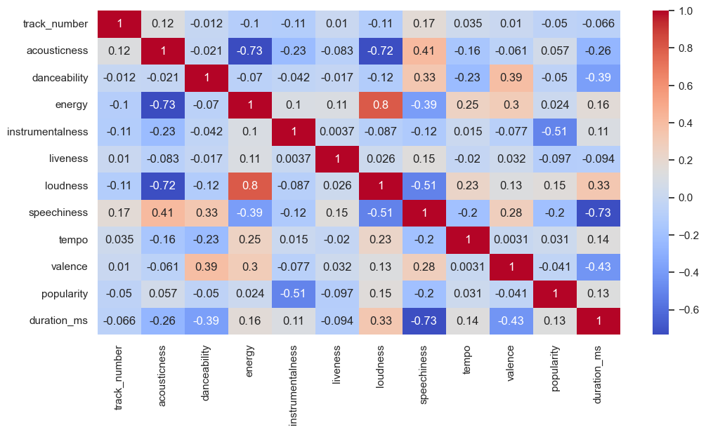
Figure 2
After looking through the correlation matrix and the dataset in general, I noticed that there were entries that were either Karaoke albums or other remixes of Swift’s music. Because I am more interested in the original versions of the song, I plotted the popularity prior to cleaning the data then plotted it after.
The figure below shows how the popularity scores of Swift’s music releases before and after removing remixes and versions that are not the original.
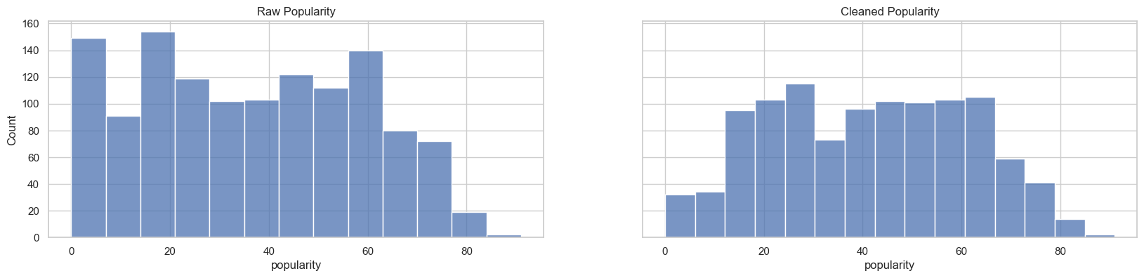
Figure 3
Visually seeing that there were differences in the popularity between the cleaned and original data, I have made another correlation matrix. Although numbers are somewhat close, there are some differences.
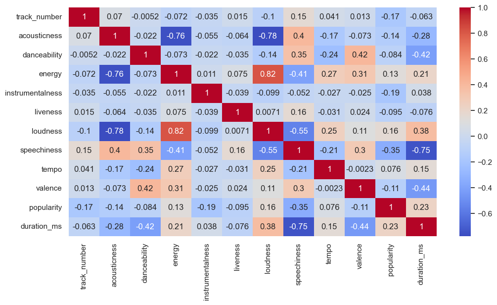
Figure 4
Taylor Swift has placed lots of emphasis on the dates that she releases songs. She famously has emphasized the number 13 in release dates. In addition to this, the timing of releasing music can be impactful in terms of award nominations and competition with other artists. Below is a figure showing the distribution of the day, month, and year of her releases.
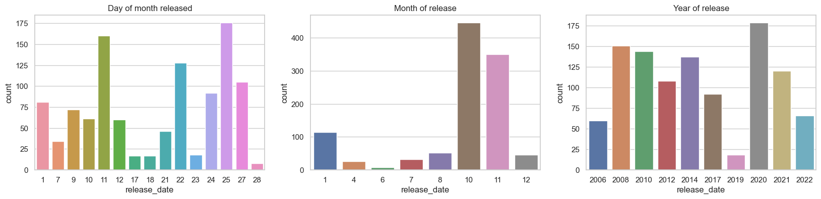
Figure 5
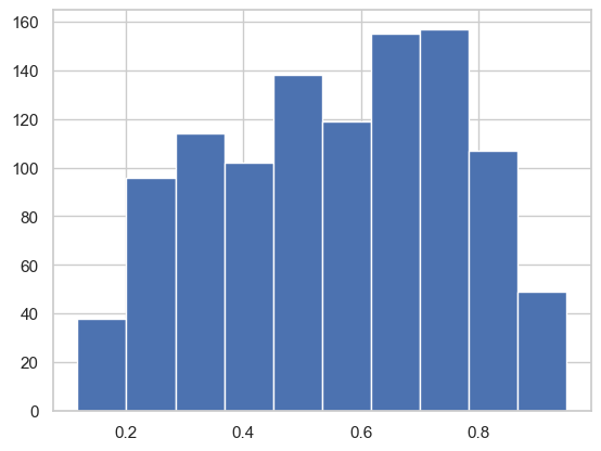
Lastly, I was interested in seeing the energy in Swift’s songs. In future research with this data, it would be interesting to see how the energy levels measure up with other factors such as speechiness or acousticness. The graph below shows the energy level on the x-axis on a scale from 0-100%. On the y-axis, it shows the count of how many songs fall into that specific level.
Conclusion
The graphs in this post only give a glimpse into the trends and interesting aspects of Taylor Swift’s discography. In future posts I will go into further detail as to what these figures mean, and what conclusions we can potentially learn from them. Furthermore, this post will be updated occasionally with more graphs, so make sure to come back periodically!
Complete code and more graphs (and a fun prediction model) can be found in the following GitHub Repo